Geobrowser Layout
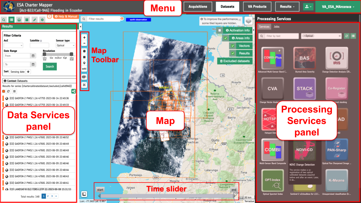
The layout of the geobrowser in the ESA Charter Mapper is composed of:
-
Menu, is the bar at the top of the screen which allows users to switch among predefined search, import external EO data and log out;
-
Map, located in the center is the panel dedicated to map services (the map area);
-
Data services panel, located on the left is the panel showing all info about the current search and the saved results. This panel is splitted in more tabs, shown only one at a time to improve focus and usability:
-
Processing services panel, located on the right is the panel dedicated for on-demand processing.
Check out the below silent video of the ESA Charter Mapper about the activation workspace graphic user interface. It describes principal components of the Graphic User Interface (GUI): Map, Menu, Left and Right Panels.
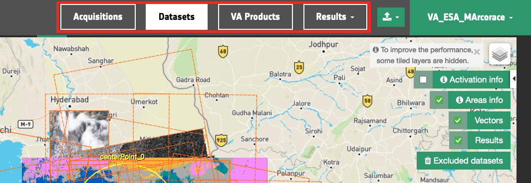
Menu
The menu bar of the geobrowser is placed on the top of the interface.
Tip
Click on the icon of Charter in the left side of the menu bar to go back to the PM/VA home page.
It provides access to multiple Data contexts. Each data context represents a result of a query on a specific catalog with pre-defined search parameters (e.g. all Calibrated Datasets of an activation). By choosing a context the current search will switch with the relative Opensearch Description and optionally with the relative search parameters.
Note
The menu bar adapts to the screen size. With smaller screens, it becomes scrollable with arrows for navigation (left or right), as shown in the image below:

Data contexts
The contexts menu for an Activation Workspace contains the following data collections:
-
Acquisitions collection of source EO products notified by COS-2,
-
Datasets collection of pre-processed datasets generated by the ESA Charter Mapper after the harvesting and calibration,
-
Results collection of
My ResultsorShared Resultsgenerated with on-demand processing in the ESA Charter Mapper, -
VA Products collection of Value Added (VA) products notified by COS-2 (e.g. cartographic products derived by VA during the activation).
The default pre-defined contexts depend on the workspace type. When accessing the activation workspace the Datasets context is the one selected by default.
Product import
Next to the data context buttons, on the right, is located the Product import.
Logout
On the right side of the menu is located the logout button.
The below silent video explains how to access the ESA Charter Mapper activation workspace via the portal landing page and via the COS-2 Dashboard.
Map
The Map Services panel is a simple geographic map, on which you can zoom in, zoom out, pan and see all the geographic features of the current results.
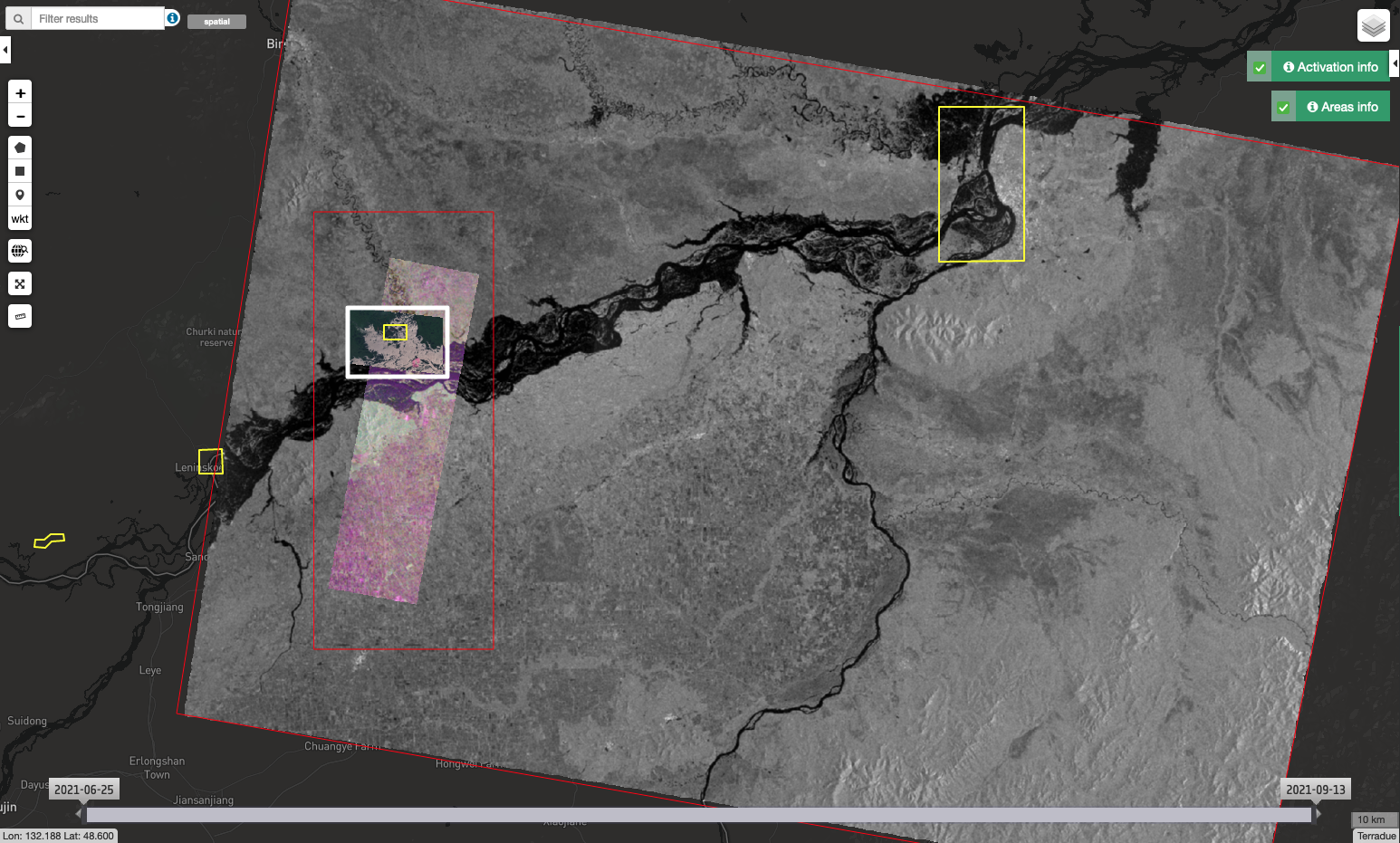
The Map Services panel can show on the map features as:
-
Geometries (or footprints), like polygons or rectangles or points;
-
Spatial image, like a jpg or png inside a defined bounding box;
-
WMS layers;
-
Titiler layers.
Five dedicated map widgets will appear on the top-right side of the map interface.
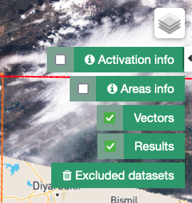
With the first two buttons, Activation Info and Areas Info, the user can find additional information about the Activation and the Areas of Interest. Both widgets have a checkbox, to show/hide the relative data on the map, and a button, to open a popup with the relative information.
Activation info
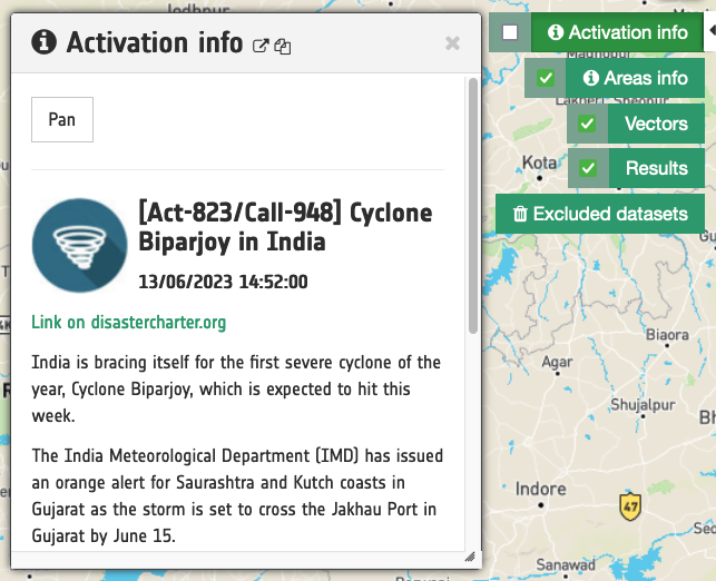
By clicking on the Activation Info button, a dedicated draggable and resizable window will appear, containing the details about the Call:
-
Activation/Call ID,
-
Activation Title,
-
Date and Time of Charter Activation,
-
Link to the page dedicated to the Call on the Disaster Charter website,
-
Summary of the event,
-
Call Status,
-
Activation tags.
Bu clicking on the checkbox users can toggle on the map the Activation geographical information, usually represented by an Activation marker.
Areas info
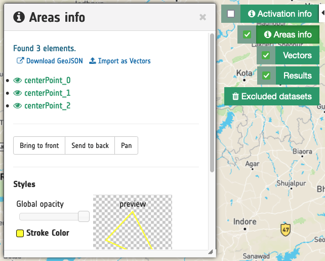
The Areas Info widget is linked on the Call areas of interest footprints, which by default are visible on the map.
By clicking on the Areas Info button, a draggable and resizable window will be open. In this window users can interact with the single areas, in particular user can:
-
bring to front/back the areas layer;
-
pan the map to the entire areas bounding box;
-
check out the list of the areas;
-
click on a single area text to zoom on the relative area - a popup with filter tool appears, to apply a spatial filter on current data search;
-
show/hide the single area footprint;
-
change the visualization style of the areas footprint (color, background, background opacity, and so on)
By clicking on the checkbox, like for the activation info widget, it's possible to toggle the entire areas layer on the map.
Vectors
The Vectors button allows the user to turn off/on all GIS Functions vectors visible in the map.
Results
The Results button allow the user to turn off/on all current search layers visible in the map
Excluded Datasets
The Excluded Datasets widget is pointing to the Datasets excluded by the users in the activation workspace. When the user clicks on this button the Context Menu switches to the Excluded Datasets collection and the Results tab is showing the list of segregated Datasets.
More info about the Exclusion of a Dataset can be found here for more info
Data services panel
The Data Services panel shows all information about the current search and the saved results. This panel implements three of the “Information Seeking Mantra” interactions (search, list results, details on demand).
These three interactions are represented in three different views and panels: the search panel, the results panel and the details panel. The search and results panel are represented by tabs, whereas the details panel has not a tab and acts a "floating panel" (see the details panel section).
Two extra tabs are handling the user saved results and the user defined Data Packages.
To improve focus and usability, one tab is visible at a time, via a tab switcher. Users can open or close the Data Services panel via the Tools button.
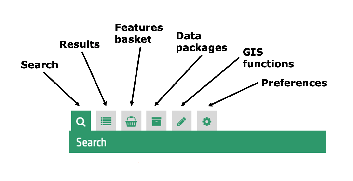
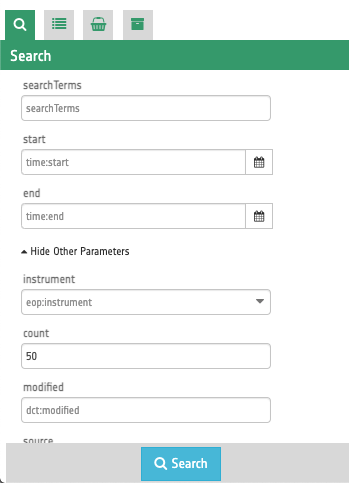
Search
The Search (or Advanced search form) tab is a view containing all search parameters associated to the current catalogue on which the search will be performed. The search panel is shown as a form, and, depending on the opensearch descriptor document, some parameters are just free text, some of them have type restrictions, others can be chosen from a list.
Some predefined parameters, if present on the opensearch descriptor, are also visible as an external widget on the map, like the Time slider, the Search terms and the Geo Filters. The startIndex standard parameters is also shown as a pagination widget inside the results panel.
The below video shows how to employ advanced search filters. For instance how to find a cloud-free image over an AOI to be imported as reference from an Open and Free EO data catalogue.
Results
This tab shows the result of the current search as a list of features (also called products). Some search results are also visible on the panel header. When a search is done this panel automatically is activated showing the results.
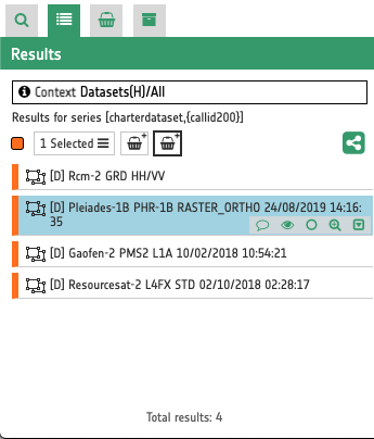
From the results panel users can do different interactions and operations:
-
see all results in a scrollable list
-
check the type of feature
-
select one or more features
-
open the details panel for a feature (double click)
-
highlight a feature on the map (if the feature has geospatial information)
-
apply filter criteria
Filter Criteria
In the upper part of the Results panel are located multiple Filter Criteria that allow to quickly search for EO data based on the following five parameters:
-
Area of interest (AOI)
-
Satellite
-
Sensor type
-
Data range
-
Resolution
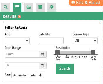
The Filter Criteria also allows to change the sorting type and the sorting direction. There are three sorting types:
-
Acquisition date (default): the sensing date/time of the product;
-
Ingestion date: the date/time when the product has been ingested either from COS-2 or manually;
-
Satellite: the name of the satellite/platform of the product.
Warning
To activate the Resolution parameter under Filter Criteria, you need first to choose among Optical or Radar under the Sensor type filter.
Check out the below silent video demonstrating the capabilities of filter criteria functionalities (e.g. search for AoI, Satellite, Sensor type, Data Range, etc.).
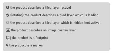
Feature title and icon
From the results list each row (or feature) has a representative title and icon. The feature title is made by a short string describing the product. The feature icon aims to identify the type of the product and the status of the tiled layer. Here below, a legend shows the possible statuses for a product in the result table:
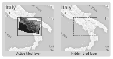
In order to improve the performance and the User experience, when the result of a search includes multiple tiled layers, some of them can be active whereas others can be hidden. This behaviour happens after a certain level of zoom, moreover the actual number of the active layers is dynamic and depends on the number of tile requests necessary to show the layers on the current view on the map.
A user can interactively choose to see a hidden layer, by clicking on it on the Results Panel or directly on its footprint on the map. Footprints are indeed always visible on the map. Furthermore, a User can decide to "lock" one or more layers to study, for instance, correlations between them.
On the map, products containing active/hidden tiled layers differ as shown:
Feature buttons
By mouseovering a feature a group of buttons appears.
The feature buttons are:
-
 Show details to access the details panel containing a summary description about the relative feature;
 -
 Toggle popup (only for features representing a layer on the map): a popup will appear/disappear on the map feature, to quick understand the feature collocation on the map;
 -
 Show/hide feature on the map (only for features on the map): the feature's layer representation is showed or hidden on the map;
 -
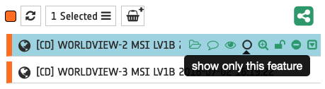
 Show only this feature (only for features on the map): all other feature's layers are hidden on the map, and the features also becomes selected;
 -
 Zoom on the feature (only for features on the map): a pan/zoom is done to fit the map around the feature's layer;
 -
 Lock/unlock feature (only for features representing a tiled layer on the map): this tool "locks" (or unlocks if locked) a tiled layer, so it becomes always active and visible on the map (for more info about this behaviour see Tile layers;
 -
 Exclude the dataset to segregate a dataset. With the exclusion of a dataset, the feature will be hidden from the list of available datasets of the Activation;
 -
 Show assets: after the click a list with all single-band assets (CBNs) included within the Dataset will appear under the feature title.
By double click on a feature on the list the Details panel is opened, containing a summary description about the relative feature.
The below silent video explains how to interact with features in the results panel. It describes the feature icon title, and the group of small buttons appearing under the feature title after the mouseover.
Features basket
Users can save the features from the results panel into a personal user space called Features Basket (or saved results) tab. This panel is similar to the results panel, since it has a list of the features saved by the user and those features are visible in the map and on the details panel, but it could contain features from different catalogs. To put features into the features basket users can simply drag one or more features on the features basket icon.
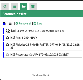
Users can navigate among the features (like on the results panel), remove one or more features or clean all the features in the basket.
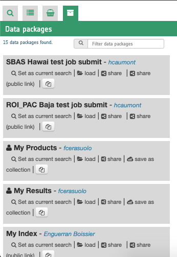
Data packages
A data package is a saved collection of features. The Data Packages tab shows all data packages visible to users. A data package can be opened by replacing it with the Current Search.
GIS functions
The GIS Functions tab offers multiple widgets to create and digitize vectors in the map. With this function the user is able to create point, polyline, polygon or multipolygon features online within the workspace, by drawing the shapes on the map. More details about the GIS functions can be found here.
Preferences
In the Preferences panel the user can configure geobrowser preferences. In this panel the user can:
-
decide if showing or not showing the popup wizard at startup,
-
decide if enabling or disabling the smart map tools,
-
choose the TiTiler resampling method among (
average,nearest,bilinear,cubic,cubic_spline,lanczos, andmode).
Details
The details panel is a "floating panel", that is a panel not visible as a tab. Users can also see this panel from a specific feature, by double clicking on it, or by opening the details from the popup. This action shows in a vertical scrollable layout page all description information of the feature, including summary, images, key-value information.
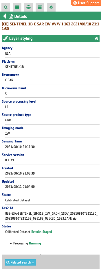
Also, from the details panel user can perform some actions like:
-
download the feature from its source (if download is available)
-
filter the current search by the feature spatial information (related search dropdown);
-
check out some feature-correlated results (the buttons depend on the specific feature type: for example we can have the buttons "show acquisition" or "Search for Source Dataset");
-
manage the layer styling options on the relative map feature, if available; for example this is available for features representing full-resolution browse products (see Titiler Widget and Raster visualization functions for more info).
Processing services panel
While the Data Services panel allows users to navigate and retrieve information on the data, the Processing Services Panel allows users to perform operations on the data. The Geobrowser uses WPS standard to provide rules for standardizing inputs and outputs for invoking processing services. From the processing panel users can:
-
navigate among available processing services;
-
see a processing service in the details;
-
execute a processing service (job);
-
search for executed jobs;
-
show details for a selected job;
-
show results on the Map Services panel and Data Services panel.
To do this there are 4 views: Services tab, Service Details, Jobs tab, and Job Details. For non logged users it is only possible to view the jobs information and results.
Services tab
This tab contains the list of available Processing Services.
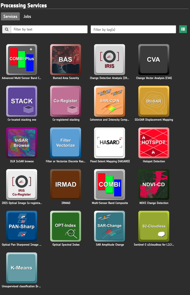
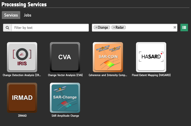
Users can employ free text or tags filters to quickly find a specific type of service. Below image shows an example of filtering by employing 2 tags Change and Radar.
Note
Find more information about the service tag filter here.
Choosing a service the relative details are shown. Click on the service icon to access the Service details.
Service details
This view provides a description of the selected service that includes service title, version, and caption, plus 3 hyperlinks pointing to:
-
a silent video presenting the service and showcasing how to use it,
-
the service specifications,
-
and the tutorial.
In the below part the service details panel shows a form of all service inputs and the Run Job button to trigger the on-demand processing.
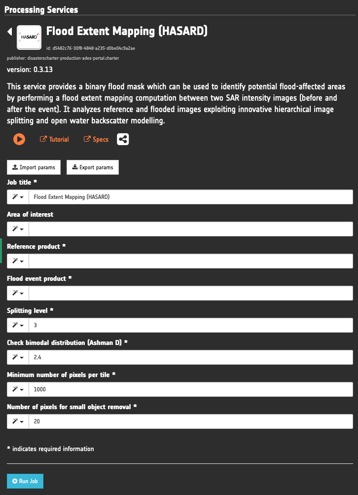
Users can fill the form manually, by feature dragging (if available for the input) or by the geobrowser clipboard. Is also possible to import and export parameters set in a json format.
Note
Find more information about the drag and drop of features here.
Jobs tab
This tab contains the list of available jobs associated with the user or thematic app. Users can filter the job for job title or job type (Show only mine, Show workspace jobs). Details on jobs can be accessed by clicking on the title of the job.
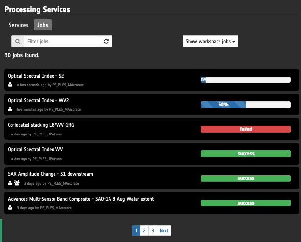
For running jobs, having Running as status, it's possible to view the running percentage status.
Once the job is accomplished the status will change from Running to Success or Failed.
Job details
The job details view contains all job information, like some service info, job time, job author, job status (running, succeeded, failed) and job results. A job result can be represented as a Opensearch Description element, so users can see the results of a job on the Map Services panel and on the Catalogue control by changing the Geobrowser Current Search with the job result. It's also possible to resubmit the job with the same parameters.
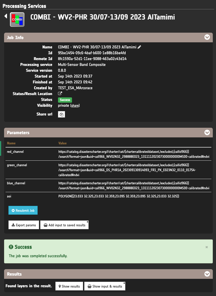
The final status of the job can be either Success or Failed. If successful the user can show the result in the map by clicking on Show results or Show input and results buttons located in the bottom of the service details. In case of failure of a job the user can contact the support team by clicking on the Contact Support button.
Note
Find more information about the drag and drop of features here.